photoshop制作鍍鉻文字教程
2022-12-25 14:46:43
來源/作者: /
己有:43人學習過
作者活力盒子 翻譯 出處:webtoolkit4.me
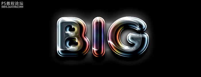
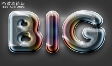
效果:
以下是詳細的photoshop教程步驟:

雙擊字體圖層打開圖層樣式窗口。單擊漸變疊加,創建漸變,設置如下圖:
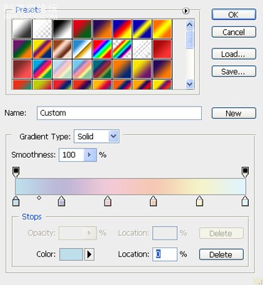
我們將需要以下6種顏色(從左到右):
1. #bedeec
2. #bcb7d7
3. #f0c9d7
4. #f5c8b5
5. #f5f2ca
6. #dff3fe
,現在我們就能得到下圖的效果:

回到圖層面板,點擊光澤,使用如下設置:
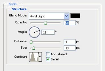
現在我們得到的效果應該像這樣:

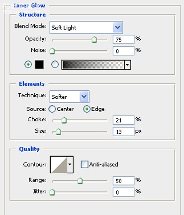
現在我們將應用以下風格:內發光,外發光,內陰影和投影。讓我們看看它們的設置:
內發光:
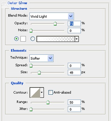
外發光:
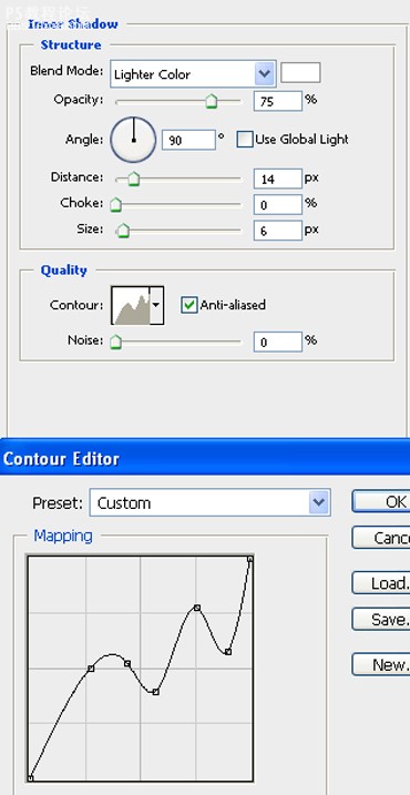
,內陰影使用自定義設置的等高線,如下圖:
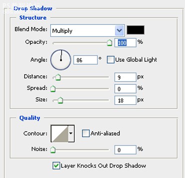
投影:
這是設置完之后的效果:

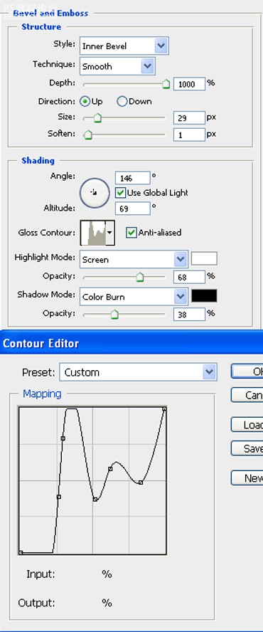
,看起來不錯,但我們還可以改進它。實際上它還并不像鉻。我們必須去應用下圖的斜面和浮雕風格。讓我們看看這些設置。自定義的等高線也可以在下圖找到:
我們會得到這樣的效果:
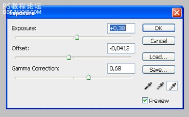
這樣看效果就更好了。顏色深一些會更好不是嗎?去圖層 新建調整圖層 曝光度,并輸入以下設置:
這就是我們的最終結果:
效果:
以下是詳細的photoshop教程步驟:
雙擊字體圖層打開圖層樣式窗口。單擊漸變疊加,創建漸變,設置如下圖:
我們將需要以下6種顏色(從左到右):
1. #bedeec
2. #bcb7d7
3. #f0c9d7
4. #f5c8b5
5. #f5f2ca
6. #dff3fe
,現在我們就能得到下圖的效果:
回到圖層面板,點擊光澤,使用如下設置:
現在我們得到的效果應該像這樣:
現在我們將應用以下風格:內發光,外發光,內陰影和投影。讓我們看看它們的設置:
內發光:
外發光:
,內陰影使用自定義設置的等高線,如下圖:
投影:
這是設置完之后的效果:
,看起來不錯,但我們還可以改進它。實際上它還并不像鉻。我們必須去應用下圖的斜面和浮雕風格。讓我們看看這些設置。自定義的等高線也可以在下圖找到:
我們會得到這樣的效果:
這樣看效果就更好了。顏色深一些會更好不是嗎?去圖層 新建調整圖層 曝光度,并輸入以下設置:
這就是我們的最終結果:
上一篇:利用圖層樣式制作漂亮的彩色霓虹字
相關推薦

彩繪藝術字, PS液化工具制作彩繪背景設計教程

Photoshop制作非常流行的金沙立體字,細膩的金沙字體,金粉字。

Photoshop制作金色的海報標題文字教程

Photoshop使用筆刷制作書法藝術字教程


